Overview
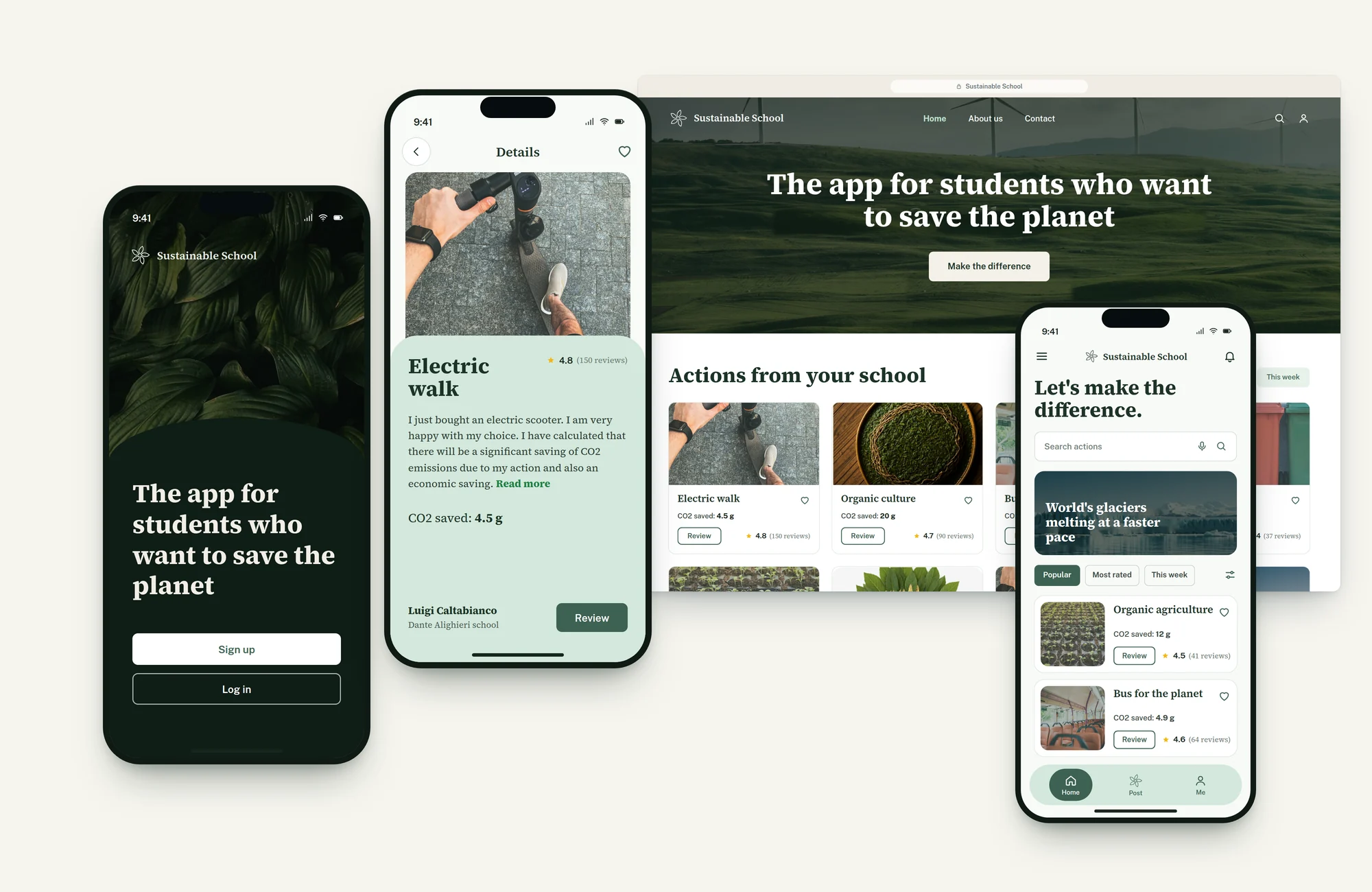
A mobile app and responsive website that help high school students track and share eco sustainable actions. The goal was to build climate awareness through personal impact, social engagement and peer evaluation. I led the whole UX process, from research to high fidelity prototypes.
The problem
Students want to act against climate change, but often do not know what to do or how to see the impact of what they do. The tools they could find lacked clarity, accessibility and engagement, so motivation stayed low and few people took part.
Process
Inception
Context
The project was part of the Google UX Design Certificate: a concept app for high schools in the Catania area. The platform had to encourage students to take part in sustainable actions and share their impact, promoting eco awareness and peer engagement.
Goals
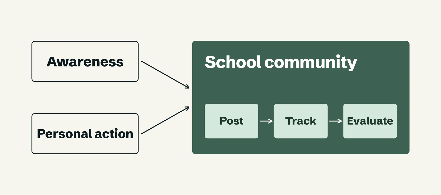
Raise environmental awareness among students and make climate action feel tangible and personal, in a space where they can post, track and evaluate eco sustainable actions inside their school communities
Discover
Research
- Desk research on climate education and existing programmes
- Interviews with local high school students about motivations, barriers and current habits
- A competitive audit of similar apps and education platforms, to find gaps in engagement and functionality
Findings
- Students care about climate change and want to contribute, but lack clear guidance on how
- They need reassurance that their efforts make a visible impact
- Simplicity and meaningful feedback matter, and so does tracking both individual and collective results
Persona and journey
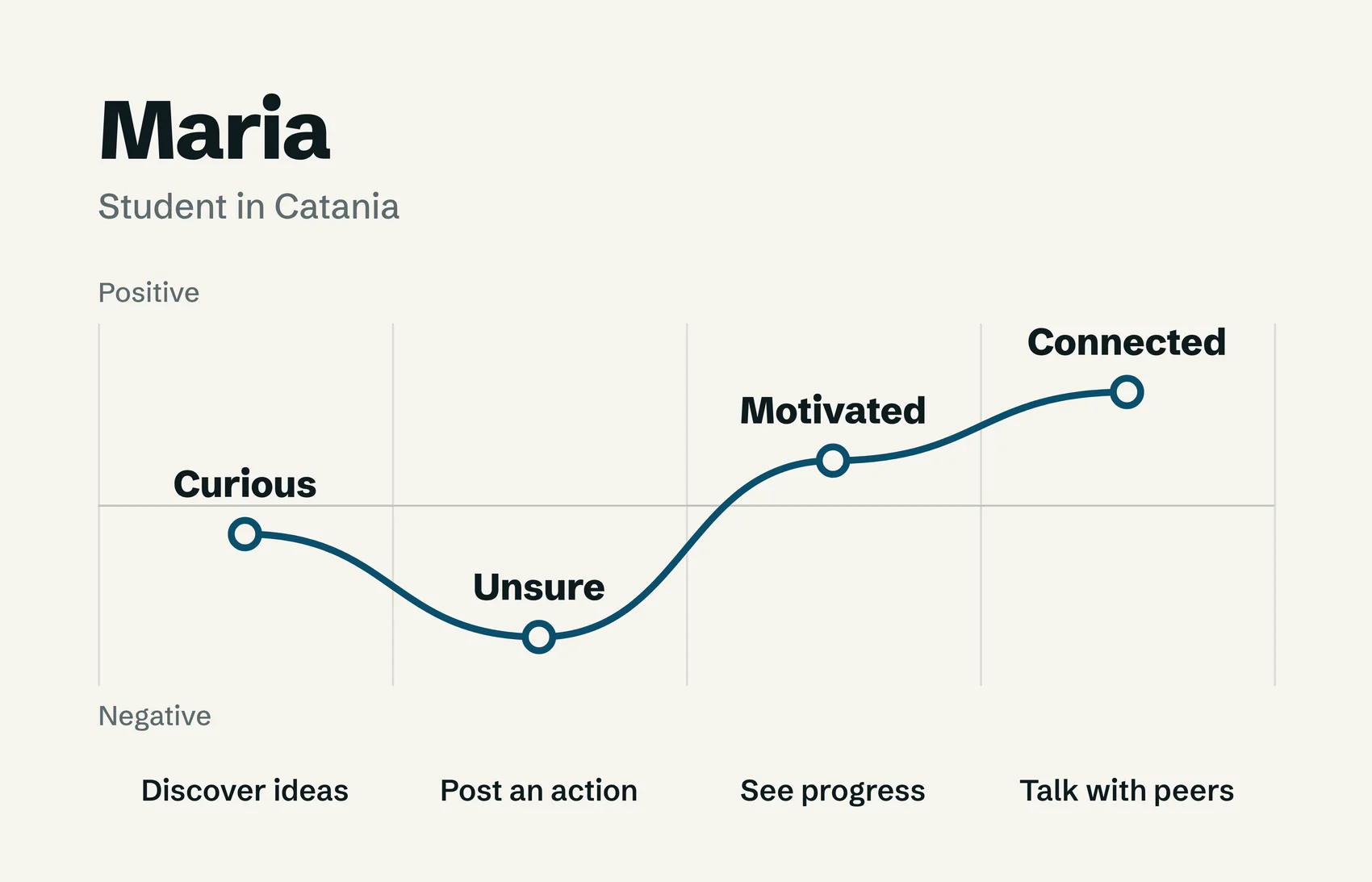
The primary persona is Maria, a high school student who wants to see how her actions, and those of her classmates, add up to climate goals. Her journey shows what she needs: discovering actionable ideas, posting her own contributions and staying motivated through visible progress and peer interaction.
Design
Approach
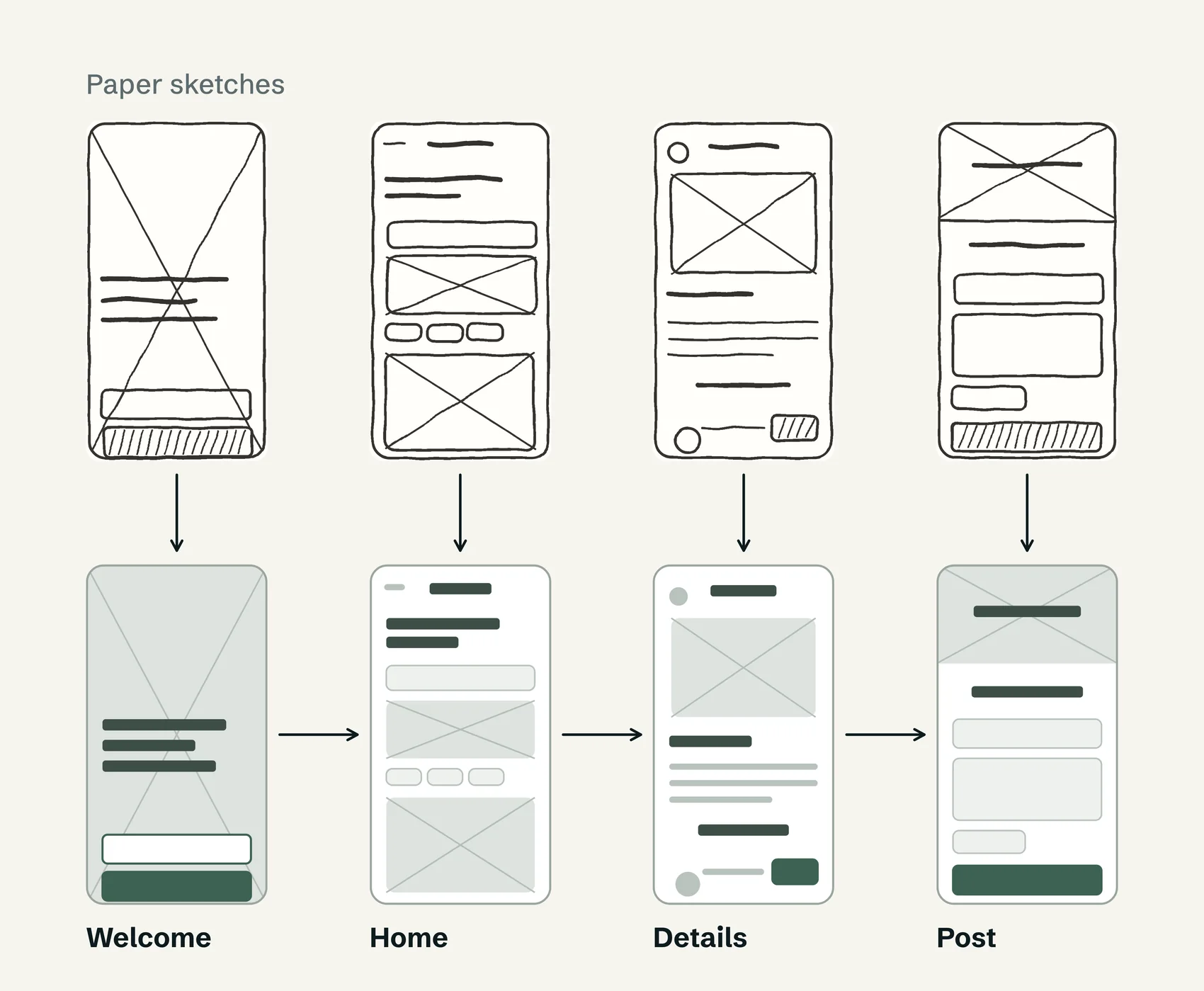
- Quick sketches and paper wireframes to explore layouts and task flows
- Digital wireframes that guide people through discovering, posting and reviewing sustainability actions
- A low fidelity prototype to test the core functionality, then a refined structure and visual hierarchy
- Clarity, ease of navigation and impact tracking as the main priorities
Test
Methods
An unmoderated remote usability study with 7 participants based in Catania, in sessions of 20 to 40 minutes. They used a low fidelity prototype to view sustainability actions, post new ones and navigate climate content, and gave behavioural and verbal feedback.
Insights
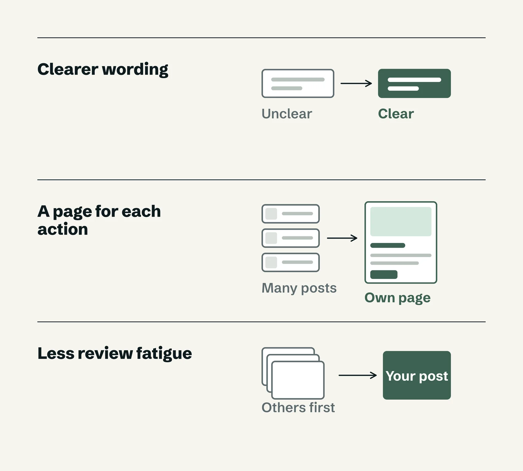
- Sections and buttons needed clearer, more engaging wording
- Each action needed its own dedicated page
- Review fatigue: people disliked having to view other posts before sharing their own
Develop
Specs
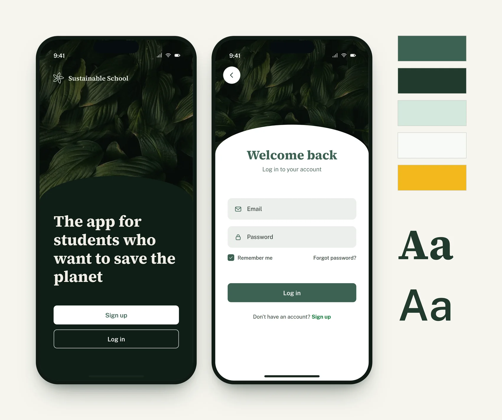
- Design specifications and prototypes in Figma, with accessibility and responsive annotations
- Scalable UI components for consistency across mobile and desktop
- A clear visual and structural hierarchy to support development
Measure
Metrics
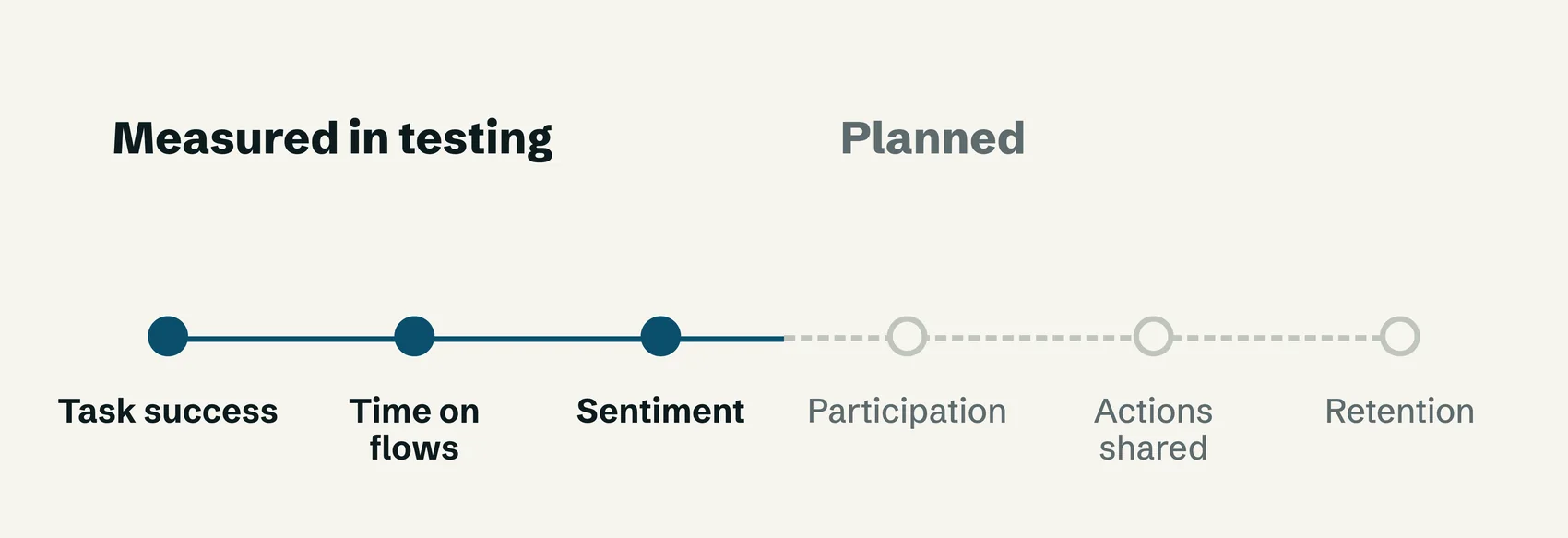
- Task success rate, time to complete key flows and user sentiment, tracked during testing
- Most participants navigated the app without guidance, and feedback showed strong emotional engagement
- Next steps: participation rate, number of actions shared and retention over time
Gallery
Outcome
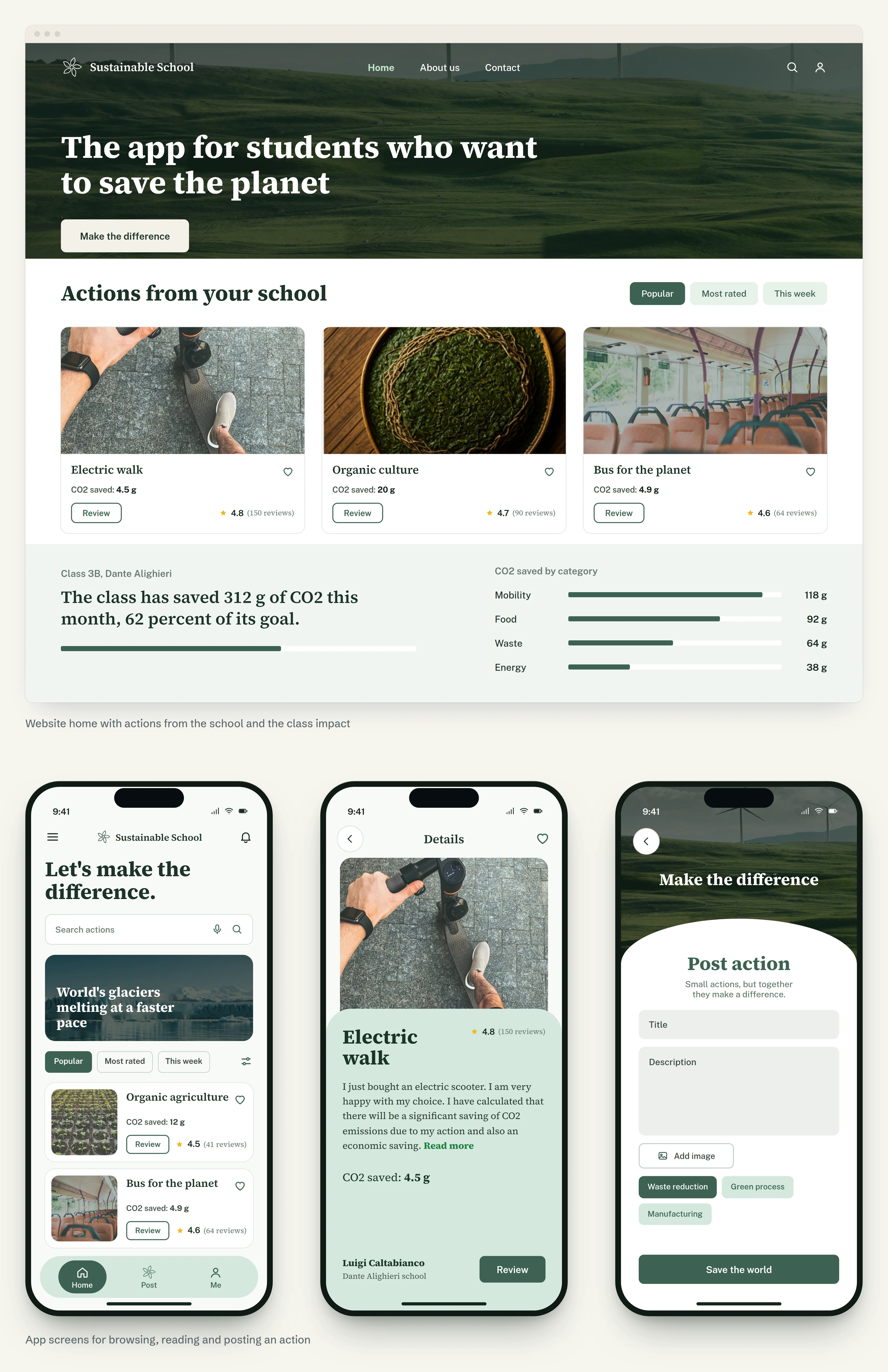
People described the app as accessible, engaging and personally empowering. It brought climate action closer to daily student life and turned an abstract issue into practical, trackable behaviours.
Learnings
Designing with clarity and empathy matters most when the subject is as big as climate change. I learned to balance ambition and feasibility by following user priorities and improving the solution one step at a time.